This log is where I post details of updates to the site. With the help of Noemard I was able to get an efficient git workflow set up. What that means is that instead of month-long development cycles with no version control, I am now doing smaller, more frequent updates to the site in a way that is easier to test & deploy. If you want to read dev updates from before this, see the old v1.0 patch notes.
Patch 1.04 - Fix item type search filter bug
Fixed a bug where selecting an 'item type' filter in the trade search would crash with an SQL error.
You can now use these item type filters such as Helms, Shields, etc. along with your keywords and results will render.
Patch 1.05/6 - Inline trade descriptions have returned
Inline trade descriptions are back across the trade GUI. You now no longer need to hover over a trade to see a preview of its description - this information is inlined next to the title, after filter badges.
Hover descriptions still exist on database entry pages in the latest 10 trades section.
Battle.net/Discord quick-copy buttons now appear in the footer of original trader (seller's) comments.
Link to stash in mobile navigation fixed.
Subheader right v alignment bug on Safari fixed.
Custom 'full search' search query parameters are now preserved when you go to page 2 of your search results.
Before they were being discarded by the engine, giving diluted/mixed/unwanted results as soon as you hit page 2.
It should now preserve the 'search settings' you specified and you can navigate from page to page without losing them. Example search for Skins of the Vipermagi with EU, PC, and Expansion filters active - go to page 2 and note that the filters are preserved.
Fixed a number of ugly scrollbars appearing on Windows Chrome/FF where they shouldn't. Scroll functionality retained - just a visual change to make more space and keep things looking clean.
Fixed issue where subnavigation would switch to that of Forum area when viewing trade search results. It should now show the trade subnavigation on the results page as intended.
Patch 1.14 - Preparing DB to receive 2.4 item and skills data changes, various bug fixes
Miscellaneous patch in which I fixed a number of bugs and made preparations for 2.4 data changes from PTR.
Modified DB import script in contributions area to take new 2.4 data schema.
Added a filter to the Runewords area that lets you filter by 2.4 in the 'patch' array.
Re-enabled new data contributions (for testing only at this time, please do not submit new data yet).
Removed stash tab limit completely (was 12, now unlimited - subject to performance), fixed height issues on stash container where listings were overflowing.
Fixed blank price check rows in the historical price checker tool (now consistent results).
Increased the number of visible price records on one page to 50.
Adjusted layout of price check page to emphasise values more (moved date further along in sequence).
Fixed issue with Switch filter being erroneously selected when editing an existing trade. It now behaves normally.
Disabled default region selection when finding trades - this was unintentionally gating off a lot of trades because of the perceived region lock (which doesn't exist). Now when you search, it will search all regions by default basically, but you still have the option to filter by region.
Fixed item icon overlap in 'item' field when editing an existing trade.
Added quick message links to report pages for mods, to make it easier to contact those involved in report.
Added pagination to moderation log. Blackhorn's Face now correctly shows in relevant filter results in DB and has ethereal/upped data visible. Sigon's Guard now correctly shows as a variant of Tower Shield. GullDagger now correctly shows when filtering by Magic Find.
Adjustment to sales data to account for 47k sales in 1.0 purge, added onto sold total.
Fixed clear floats bug on view trade page after Bnet/Discord contact buttons.
Remove phantom layout for acc switching where there shouldn't have been any.
Various fixes to the 'most popular' block on the index (removed initial animation and fixed vertical alignment/col width).
Fixed Chrome/FF positioning hover bug on unread mail counter badge in user dropdown.
Selecting the size of charm as an additional (redundant) advanced filter when creating a trade no longer overwrites the unique graphics of Hellfire Torch, Gheed's Fortune, or Annihilus.
Fixed issue where marking a WTB listing as sold would denote it as having been a WTS listing.
Clipy link fixed in the Credits section.
Fixed v1.0 patch notes link in areas preceding creation of a feedback/bug report.
Fix header info on forum warning for posts (added extra info about not asking for price checks here).
Fixed a typo in the Amulets dialog regex warning when creating a trade.
Keyword notice added to the Find Trades section so that all users aware a keyword must be used to obtain results.
Fix sidebar overflow for ads block in some cases where it would break layout.
Added reminder to check junk mail to the password reset page.
Disabled adblocker prompt completely for Donators, Contributors, and Moderators.
Actual data import to populate with 2.4 data is to follow soon, this is just another prep patch.
Added a new mini-feature to speed up price checking from the Create Trade page. After selecting your item from the dropdown when creating a trade, buttons will also appear allowing you to see recent and historical prices, as well as any outstanding WTB listings (as before):
In all database categories there is now a filter under the 'Misc' tab that allows you to filter by items 'affected' or 'changed' by the 2.4 patch. Items changed by 2.4 have a green indicator on the tooltip, in the category, and on the entry page itself (hover over Pattern for example). Each category page also now has a descriptive block corresponding with its meta description.
Added graphics assets and DB entry slot for 3x3 Keyset so that people can use it to list in the trades area.
500 character limit on trade descriptions now no longer applies when editing Player Services type topics (allows for longer descriptions).
Database column gameversion added to distinguish between different records depending on game build (for future dev).
Fixed but where 'see all WTB listings' button would take you to an unfiltered search showing WTS listings too. Behaves as expected now.
I have archived the pre-2.4 data for later comparison in another update (you'll be able to switch game versions and compare etc.) and have updated the following DB entries to use the new 2.4 PTR data, taking into account recent revisions to the official patch notes:
As for skills changes, it will take a bit more work. diablo2.io has data for each individual skill level from 1 to 60, instead of the max of 20, so that people can theorycraft beyond conventional maximum skill levels. To do this, a group of contributors put together the actual formulas so they could go past stats for 20, and then the results were cross checked in-game using a Hero Editor hacked character to confirm.
This means that simple changes like increasing X by 20% now need to be constructed inside these original formulas for us to be able to extrapolate the 20-60 skill level range of stats. If you want to help contribute to this process of updating the skills 'matrix' please private message me and I will explain what needs doing and give you access to the sheet etc. The original authors are no longer active, so we need to pick it up again.
Patch 1.18 - Graphs for viewing sales of any item over time
You can now view the price history of any item as a line graph taking no. sales per day up to the current day (minus three for price archive threshold) as its argument. This lets you observe trends in the 'supply and demand' of items over time.
For example here's the price history for Harlequin Crest. Notice the peak at the beginning of the game when everyone was looking for MF, then the trend downwards as it became less in demand.
Conversely, if we look at Hellfire Torch, we can see the number of sales increasing as time went on and more people wanted torches for their characters.
There is a larger graph available on each item's respective historical price history page, which has a finer scale increment and allows you to pan and zoom through time to see date ranges up-close:
This is just one iteration of the AnyChart library - there's a lot of other cool applications I can use with this and I'm excited to build out more use cases. In the future I'll be able to let people draw graphs to compare items or arrays of items at the same time, and other cool stuff like that.
There are markers along each graph to denote important 'milestones' in the game such as the various patch launches.
Btw I've paid for a license guys, just waiting for them to give me a Key so I can get rid of the 'trial version' bit
Patch 1.21 - Trader history (all time) implemented, sales over time graph on profile
You can now look back over all the trades you have completed since the beginning of the platform, including what you sold them for.
Go to your profile > Trading History and you will find a similar UI to the price check tool, except that it is a list of all of the trades you 'sold' from all time.
This does not currently take into account 'purchases' but this will come in a future update.
Additionally, a mini-graph showing the number of sales you completed historically is also now visible on your profile/stash page:
Fixed a minor bug where the subnavigation would appear blank on viewing one's own 'recent sales' or 'all trades' in the search results UI.
To reduce the incidences of potential buyers making offers on trades that they do not meet restrictions for (ladder/HC/specific platform are the usual culprits), I have duplicated the warning blocks into the quick reply editor. They will pulse animate when the user starts typing or clicks on the 'make offer' text box. Hopefully this will help with informing even the most inattentive users that they are about to make an offer on a Ladder trade for example:
I may make this even more prominent in future updates. Want to start off small and see how much of a difference this minor change makes.
Patch 1.22/1.23 - Squelch feature fixed, direct squelch button from the trade listing, various bug fixes
Fixed the 'Squelch a Trader' feature - bug causing OP and others' posts to be squelched has been fixed. Now functioning as intended (only the squelched person's posts will be hidden).
Removed the 1 hour delay for squelching. When you squelch someone, it now takes immediate effect.
You can now also squelch traders directly from your trade listing's page, making the process much easier and more obvious (it was buried in the user control panel before).
What does 'squelching' someone do?
If you are having trouble with traders hijacking or riding on your existing active trades, you can squelch them. This hides their offers on your trades to anyone except themselves. Also useful for 'muting' or 'hiding' offers on your trades that you think are causing issues.
'Trade Jacking' is where a member searches for others' listings and offers their own item for sale inside someone else's trades. This breaks the rules but no amount of reporting or moderation can deal with it fully.
Squelching is a form of self-moderation now available to you to deal with this problem yourself. Squelching someone means that their comments will not be visible at all on your trades for anyone except the squelched trader.
The person squelched will not know that they have been squelched, so if they continue to attempt to jack your trades they will still see their own comments but will be wasting their time as no-one else can see them.
Note that this does not affect other forums or areas on the site - only the trading marketplace.
A trader you have squelched is still able to send you private messages/interact with you and any others inside the trade to some degree, so bear in mind that this is not a full 'block 'tool - it is specific to trade jacking by comment.
A squelched trader that comments on your trade will still reset its expiry timer and bump it like any normal comment would, the only difference is its invisibility to others
You cannot squelch admins or mods.
Look for the brown 'Squelch' button next to the person's post to squelch them instantly:
When browsing the Runewords category of the database, filter group for required sockets is no longer additive (meaning you can only have one of the required socket filters active at any one time):
On your profile, there is now an additional data row under 'Contributions' which counts the number of 'Best Answers' you have in the general discussion forum, bug reports subforum, and feedback subforum. This is to recognise users who are especially helpful on the forums:
Fixed bug on some mobile devices where the 'give X trust' button was not visible when in portrait mode.
Made trust badges slightly smaller on mobile devices when viewing a trade listing.
Typo on Skeleton Mastery auxiliary data point 'Skeleton Life' fixed.
Fixed bug where price checking a Runeword would display an empty icon frame in the top left of the page.
Fixed wrong link to price check subforum when warning general discussion forum posters not to post price checks here.
Various template fixes concerning post/offer footers and signatures.
Fixed bug where copying the copy paste section in a trade listing's footer would cause a confirmation message to show in the demand graph too.
Patch 1.24/1.25 - PTR data updated for 2.4 throwing/Javelin item stack quantities, various bug fixes
I managed (with great difficulty) to confirm the new values for throwing and Javelin maximum stack quantities on the current PTR build, and have updated the database here with the new data. Thanks @crocorinho for your screenshots for some items not on the default PTR mules
It was not a straight 50% increase in quantity as per the blue post for every item, as some items would fall say 5 quantity short, and then it appears that the game rounds them up to the next decimal value. Eg. A 50% increase on a pre 2.4 throwing/Javelin might result in 135, so the game rounds it to 140.
Side note: a Spiculum originally only had 20 quantity (now has 30), kinda weird compared to its Normal quality base variant Glaive which had double that (40) originally despite it being of Normal quality (now has 60).
Blizzard, please can we get please get an NPC on PTR that can hand out any specified item, as was discussed in the initial developer panel PTR announcement? Say Warriv in Rogue Encampment, or even a command like /createItem id=2345? Would make it so much better than the limited item selection right now/what's available from trade NPCs.
Items affected by maximum stack quantity update on PTR:
Javelin, War Javelin, Hyperion Javelin. Pilum, Great Pilum, Stygian Pilum. Short Spear, Simbilan, Balrog Spear. Glaive, Spiculum, Ghost Glaive. Throwing Spear, Harpoon, Winged Harpoon. Maiden Javelin, Ceremonial Javelin, Matriarchal Javelin.
Added 'Has 2.4 data' filter to the Base category seeing as it didn't exist there before.
Fixed vertical spacing of the new 'Has 2.4 data' green string on updated database entries and tooltips.
Fixed issue where runeword White would not appear in filter results for Poison and Bone Spells.
By increasing countdown to 10 seconds I have hopefully fixed an issue where bump all trades would sometimes require a second click.
Fixed broken image URL for trades which have the jewel icon. Will affect all new trades made - if you have an existing jewel trade atm, just edit the listing and then deselect > reselect the jewel filter, then submit - the image will be fixed for you then.
Normalised quality for amulets which have no technical distinction for normal/exceptional/elite status, Cathan's Sigil now shows in Amulet filter results.
Fixed issue where when filtering for the '... Monsters to Flee' modifier on items like The Face of Horror, it would return no results due to a typo in a parameter.
Retired the 'swipe left or right to open nav panes' functionality on mobile. The library was super old, hardly anyone used it, and it interfered with other parts of the UI where horizontal scrolling is expected (seeing a trade's full description inline for example).
I also updated the Useful tips and tricks for using the site post linked in my signature - added some more things that aren't very obvious to a new user, highly recommend you guys check this out
Patch 1.26 - Data switching between 2.3 (Live) and 2.4 (PTR), enhanced trade info on DB entry pages and price check pages
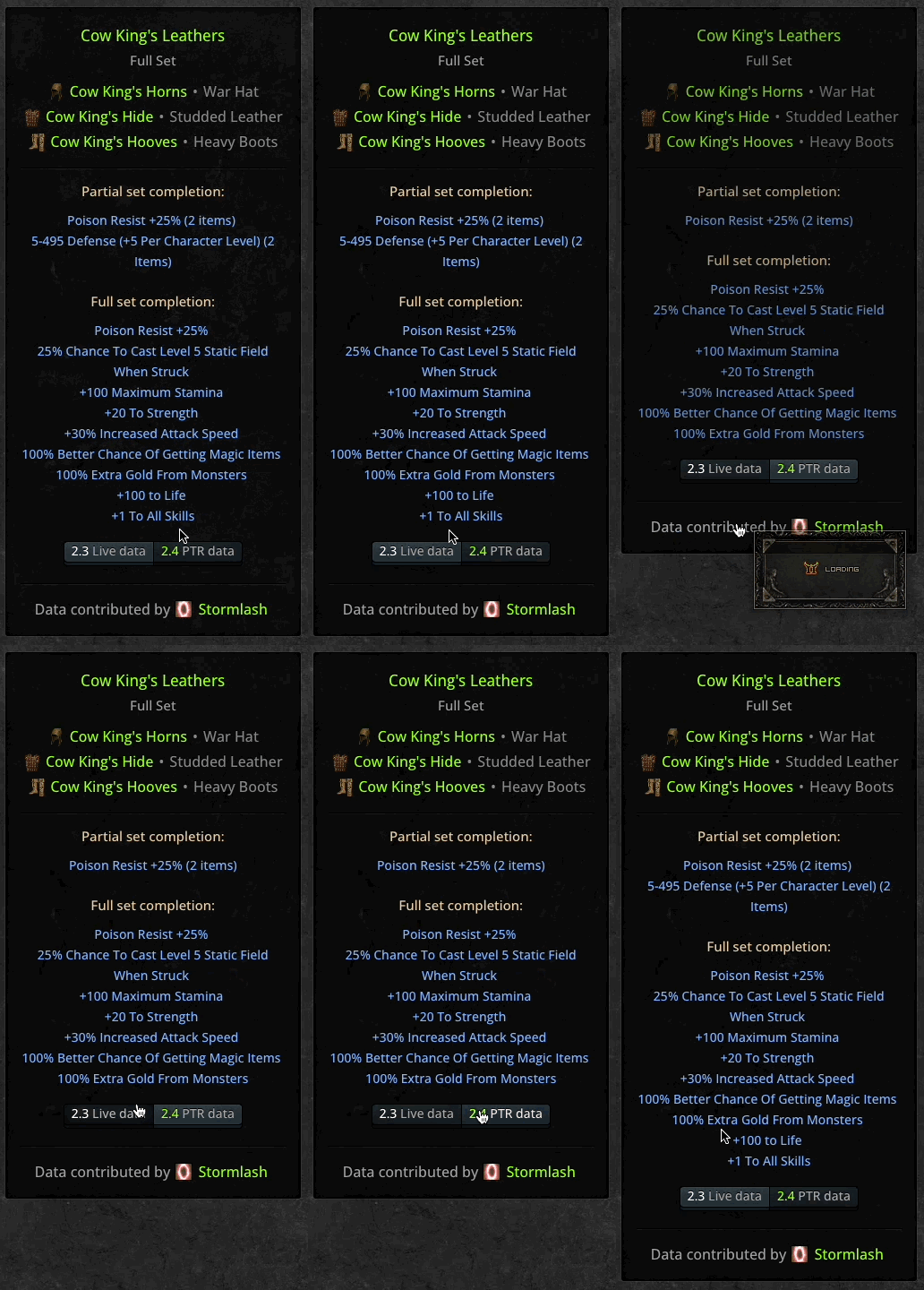
You can now switch between game versions when viewing any items in the database that have been affected by the 2.4 PTR updates. This allows you to flick between 2.3 stats (live data) and 2.4 stats (PTR data). Will be expanded in the future to cover future balance patches, so as to keep a record of all versions of Resurrected starting from 2.3:
Database entry pages now have more sophisticated trade information about the item. See Vortex Shield for screenshot below. The active listings have been increased to 20, and now show Eth/Sup/Sockets and other pedigree information useful for people scanning the list. The 10 most recent historical prices for the item are now also visible along with details about the item that sold (Plat/Ladder/HC/Sockets etc.):
All historical trade data now indicates whether the item was Ethereal, Superior, or had X no. of Sockets:
Socket icons replace text in 'Can be used for Runewords' block of Base Item rarity DB entry pages:
Fixed non-DB correlating links going to blank tooltips in the trader history area.
Fixed icon overflow in the header of rune DB entry pages
If you list a trade as PC and a Console Platform, ie PC & Switch, your visitors won't see the 'This is a Switch Trade!' reminder in the quick reply box, so as to avoid confusion when PC is available as well.
Items that are new to the game in the 2.4 PTR now show 'New item in 2.4 (PTR)' on their DB entry pages
Fixed bug where a graph showing unrelated mixed data would show on non-DB correlating historical price check results.
Fixed overflow y-axis on some mobile devices when viewing latest 10 (20) trades on DB entry pages.
The cron job that archives completed trades, converting them into historical price data, will now also grab the description of the trade.
This means that in the price history section, you will start seeing the descriptions of the listings alongside prices. This will start over the next 3 days.
This allows for richer historical price information from now on - as items with varying stats (and therefore values) will be more easily distinguishable in the results:
You will also note the small 'hourglass' icon and a timestamp next to it - this is the 'Time to Sale' - the time it took the seller to complete the trade, measured from the original listing time to the time of the sale.
Hovering over this timestamp will show a more detailed time including minutes and seconds, and an explanation of the metric.
This allows you to determine 'how long it took' for the item to sell, which may be another useful metric in appraising the prices and demand of your item:
The trade page has had a few touch ups and layout changes.
I've added a total sales volume spline chart to the top right, and a component for starting a historical or recent price check.
The price check search GUI has a new icon and improved UX. Replicated in the price-check/ subforum and at the bottom of historical price check results:
On the trade-stats.php page there is a new chart prototype using multiple data series.
Fixed issues with the scrubber bar on the larger graphs around the site. It's now more visible and chunkier so easier to grab.
You use it to 'scrub' through the data in the graph, allowing you to 'zoom' in on specific time ranges.
You can select/deselect series to change the lines shown on the chart - this is done by clicking the colour code in the chart's legend.
Here's an example of filtering down to just console trades, and then scrubbing through the data:
Signatures are now visible in the Trading Marketplace on both desktop and mobile.
Signatures are now visible in forum posts on mobile where they were previously hidden.
Squelch shortcut button now visible in trades on mobile (inside the cog dropdown menu).
DB comments remain without signatures to reduce clutter.
Fixed bug where the 'Bump All' function was bumping deleted listings up.
Fixed bug where database entry pages were still rendering links to deleted trade listings occasionally.
Added '2.4 data' filter to the Areas database category.
Fixed issue where most liked posts weren't at the top of the sorting order on database entry pages.
See Hellfire Torch for a clear example of ordering by comment likes after the fix.
Patch 1.30 - Hover navigation, various UI, performance, and other fixes
The site's navigation can now be hovered over to reveal the sub navigation of each main header.
Links in the navigation bars are now block shaped making them easier to click.
A blue gem indicates which element is being hovered over. This persists until the cursor leaves the navbar.
Making the navbars interactive like this should help you navigate the site faster, jumping directly to sub-areas of the site.
A proper, fully integrated forum keyword/title search has been added to the discussion forums, feedback, bug reports and contributions forums.
Searching 'in posts' returns results for keyword matches inside posts and displays them in post view.
Searching 'in titles' returns results for keyword matches inside topic titles and displays them in topic list view.
I believe that all of the advanced syntax such as *, - etc. all works the same as it does in the trade search.
You can access it from the 'More' button at the top of these pages, revealing the search bar.
Note that the original instant topic title search is still available in the top right of your screen.
Improved on (not totally fixed) annoying bug when viewing forum topic pages with lots of attachments/inline images and the blocks would jump around like crazy. This was caused by a re-layout function being called after each image load.
I have also re-enabled lazy loading on inline attachments to improve rendering speed (I turned it off by accident ages ago and forgot about it lol).
Tooltips load half a second faster than they did before as I was able to ease the (intentional) delay on them by the same amount of time. This should be kind of noticeable if you use the tooltips regularly.
Mobile users in General Disc/Feedback/Bug Reports etc. will now see the same stats and 'completion' (green) numbers as are found on desktop.
Fixed issue where items with no speciifed rarity weren't appearing the correct colour in user/trader historical sales pages.
Char limit increased to 1000 in all trade posts and comments.
Database categories look somewhat cleaner as I have hidden the 'last post by' + stats etc stuff previously found in each card's footer.
Many fixes to subnavigation - things were getting funky when using the new 'My posts' etc. pages and trade searches.
Fixed overflowing sold details buttons on DB entries when at the 1920px breakpoint. Now render on one line (just!).
Removed old scripting on the create trade page that was causing bugs when messing with the WTB/WTS filters.
Various fixes to improve the MCP report UI layout issues.
Titles on Full Set type DB entry pages are now vertically positioned properly.
When price checking a non-DB correlating item (ie a charm or other magic item), the order of sales presented is now as expected (most recent first).
Fixed various instances where guidance would link to the obsolete v1.0 patch notes.
Modified guidance in charm/jewel/amulet/ring helper dialogs to make it clearer what you are supposed to do.
Various other small changes in copy and updates to text, including the About page.
Fixed issue where runeword Crescent Moon wasn't appearing when using the '- Enemy Lightning Resistance' filter in DB category page.
Fixed a number of bugs on the navbar_header template on desktop where vertical alignment was out.
Patch 1.33 - New recipe type filters, various bug fixes and improvements
New filters have been added to the Recipes category of the database.
They allow you to filter between recipe types, which I have split up as follows:
I have also renamed some of the recipes for upgrading rare items eg. Recipe: Exceptional Version of Rare Armor so that they are standardised with the rest of the upgrade recipes for set and base/unique items.
The trade UI and price check UI have had a bit of a layout change to improve readability/UX.
This meant re-organising the order in which each data point appears on one row, prioritising the important stuff to the left.
For example descriptions are far closer now to the sold for items, and things like this have better guiding icons.
I also removed some redundant icons that were just crowding and providing little by way of pedigree info (Resurrected trade, LoD trade).
Trader history now includes descriptions inline like the item price check results template.
The price check tool now returns double the number of results for non-database correlating items such as Charms, Rings, Amulets, and Jewels.
I have configured it to search before and after the keyword phrase, so all the people putting stats in the titles of these trades are caught by the request, where before they were omitted because there was no exact match. This results in way more price records being found. Yay
Button links for price checking a charm, ring, amulet, or jewel are now also available in listing footers themselves:
Added a relative datetime to the announcement/news block on the index page to make it clear when the announcement was originally made.
On member profile/personal stash pages, the battle.net/discord details fields are now copy-to-clipboard buttons like they are in trade listings:
Who is online blocks have had some small improvements, changing layout slightly, including a legend on the index for colours, and re-introducing avatars:
The donate page has had a bit of a touch-up, rewriting the copy to make it simpler, and adding an example of how donating changes your username colour, adds coin badges etc:
Selecting 'Yes' to the 'Hide Stash' option in your user control panel will now also hide the 'Trader stats' block.
Client render blocking reduced by loading Anychart script bundle only when needed.
Added more positive guidance on comment quick post block, giving examples of good database comments.
Additional 'Browse all trades' button added to /trade footer - the Browse Trades feature is getting a big rework soon guys (allowing multi-filtering etc.)
Fixed a typo in the clvl99 advisory noted on upped/Eth item blocks in database.
Fixed issue where misc rarity items such as Token of Absolution were showing the wrong colour in trader history.
Fixed bug where tooltips were empty when hovering over listing authors in market search results.
Better example used in copy when explaining how users should search/list charms.
Fixed height discrepancy between filter warning blocks on trade listing pages.
Fixed missing jewel graphic when hovering over global navigation on retina/high DPI devices.
Fixed layout issues on desktop on the Create Trade page where attachment and submit buttons had weird padding.
Fixed vertical positioning of the the .Io logo custom BBcode used in guide/resources lists.
Many small images throughout the trade UI are now being lazyloaded asynchronously which improves performance client and server side.
New banner image added for the Development Log block on the index page.
Fixed bug where bookmarked posts inside deleted topics were still displaying, bugging out the Saved > Post Bookmarks panel of UCP.
Fixed out of date copyright notices in the footer and renewed and verified the site's DMCA certificate.
Bug where broken jewel images still existed in active trade listings and sold trades data has now been cleaned up with an SQL replace().
Fixed bug where tooltips for Spirit, Phoenix, and Fortitude weren't displaying the secondary magic attributes field.
Fixed missing URL on about page in paragraph about this development log.
Fixed various layout bugs on the price check page, adding new header stats and a descriptive block below the item price search.
Warning blocks for PC trades have returned after popular request. You'll see them in the headers and quick reply boxes of all trade listings on the PC platform.
When selecting a rarity filter in the create trade, edit trade, and search trade UIs will now change the colour of your keywords to match the selected rarity.
Patch 1.34 - Variable stat highlighting, Perfect Gems, a tonne of bug fixes
Item stats that vary, or are a range, are now highlighted throughout the database UI.
Hover over Nagelring for example, and you'll see its variable stats for MF and AR are highlighted.
This is not clever enough to distinguish between values that are a range but remain fixed - that would be a bit complex.
As it is, I hope this change makes scanning item tooltips, database pages etc. more efficient.
Added Perfect Gems as a database pseudo-item that people can use when making trade listings/marking as sold.
I ran SQL to get the price history of Perfect Gems populated despite it never existing as a DB item, by using replace() on related/similarly titled past sales and adding the right metadata.
Did the same for the pseudo item 3x3 Keyset which was introduced at an earlier date - managed to capture 2.5 pages of extra price history from the abyss.
Historical price checker tool and Trader history have had some UX cleanup to prioritise more important info.
I've also removed unnecessary crowding icon indicators for things like Resurrected gameversion and Expansion, as the vast majority are in this category already. The icons will still show if it is a Legacy gameversion, or a Pre-Lod character.
This now re-aligns the whole trade UI - hope these changes will make scanning those results a bit easier.
I have retired push notifications. After trying for months to contact the developer I bought the license from, I've had no response.
With the bugged notifications being sent out in magnitudes of order greater numbers than normal, this was taking it's toll on the server dominating requests having to be made server-side.
I think this is justified seeing as, if my data is right, only 0.06% of the total userbase were using it (like literally 7 people).
To me, removing the broken push notifications to improve the rest of the site's performance substantially made sense.
If you still want to get push notifications, go to your notification options and get emails sent to you (then your email client will generate the push ).
Substantially reduced Cumulative Layout Shift on desktop by following Google's recommendation to use inline html attrs for things like height/width.
To translate that - now when you scroll through long topics on desktop, the blocks should no longer jump around like crazy as the images load.
Same solution not possible on mobile due to responsive design requirement, so I made some other improvements that indirectly have improved CLS.
Next patch is tackling CLS from ads which I know is awful right now - once that's sorted, the whole experience here will feel a bit less jumpy lol.
Main bulk of the patch was fixing over 200+ layout, styling, and other miscellaneous display bugs on mobile.
Things like out of position buttons and elements, weird icon bugs, CSS bugs etc.
There were too many of them to really make me want to log each one here line by line.
But yeah, mobile should look and feel slightly improved after these small changes.
Fixed missing line break in Honorimagic field.
Fixed issue affecting 2.4 data filter in DB categories which remained stuck on after switching.
Fixed issue where switching game version in the database would sometimes load ancient UI from alpha
Fixed rogue background-image icon sizes on some Retina devices.
Fail gracefully when someone marking a trade sold does so to a non-existent user. Blue colour, link removed.
Fixed issue where you couldn't scroll forum topics horizontally on mobile to see more. Now you can.
Fixed issue where you couldn't enter negative values into the 'Mark as Sold' UI.
You can now do this to indicate any 'change' you got back from the buyer in your trade.
Changed up the Adblocker prompt a bit to make it more compact:
Next patch
Now that the site is stable and I've taken care of a lot of backlog/tech debt, next patch I will be introducing:
Blizzard wrote:Battle.net verification, login, and registration! This will allow you, if you want, to 'link' your current account to your Bnet account, by logging in to Bnet via their Oauth protocol (this will prompt 2FA if you have that on your Bnet account).
Once linked, you'll get a 'verified' icon next to your bnet profile which helps your trustworthiness. It also means you'll be able to log into the site with either your normal username/password, or if you want you'll be able to sign in via Bnet. It will also allow new visitors to instantly register using their Bnet.
Also, continuous multi-filtering in the Browse Trades section is coming. This will reduce a lot of the friction that currently exists when trying to find, list, browse etc. items. It will allow you to 'just browse' without using keywords, and be able to add/remove multiple filter combinations or individual filters as you like to narrow down your results. This functionality is also going to be in keyword search results, and in the historical price checker tool too!
This is going to be a big uplift in the site's usefulness - I'm really looking forward to finally releasing this.
This patch is a major site upgrade that has focused on fulfilling feature requests and preparing the market for Resurrected 2.4 + ladder season 1. I am going to keep these notes simple and brief, and hope they explain things enough as is. If you have any questions feel free to ask. If you're looking for other development logs (before and after 1.37)click here. Okay here we go!
Multi-filtering across the marketplace
It is now possible to continuously multi-filter across the trade discovery UI - while browsing, searching, or price checking. This makes item/trade discovery feel a lot faster and easier than before. Being able to combine filters while browsing was one of the top requested features after 1.0 so I'm glad it's finally built. After searching, you can continue to filter, and if you're browsing, your config can be converted into a search if keywords are desired. There is always a 'select defaults' button for when you want to quickly add your usual filters. Filter trades by online status
You can now apply the 'Online' filter when browsing or searching the marketplace. This allows you to see only trades from online traders at the time, and is handy when you just need to make a quick deal. (Currently rolled back for performance reasons). You will also note that there are online indicators next to usernames throughout the trade UI, so you have a much better overall view of activity now. New trade filters available
There are 5 new filters you can use for trade creation and discovery: IAS (Increased Attack Speed), ED (Enhanced Damage), Unid (Unidentified), Perfect, and Free. You can now also filter by 0 sockets, non-superior, non-ethereal, non-ladder etc. letting you refine your results further. You will notice that the filter UI has been simplified and cleaned up to make it easier to navigate. It is possible to sort by listing time in searches/browse too. If you can't find the filter you want when searching or browsing, just add a keyword for it instead. 'Leech' being a good example. Diablo Clone tracker
@Schnorki persuaded me to do it eventually - I built a filterable, sortable progress tracker for Diablo Clone. The aim of the tool is to collaboratively track the progress of Diablo Clone (aka Uber Diablo) spawns across all regions and game modes in D2R v2.4. Type /uberdiablo in your in-game chat, and help us keep the tracker updated by submitting a progress update. The tracker also shows relevant Stone of Jordan trade listings from the market for your progress filter selection. Battle.net ID verify and login
If you are already registered here, you can now link your Battle.net account to your diablo2.io account via Oauth. This lets you use your battle.net credentials to sign into d2io, and proves that you are the verified owner of the bnet tag you advertise on your profile/in your trades. You get a little green lock icon next to it if it matches the Bnet tag you linked. You can now also search diablo2.iomembers by Bnet ID - handy for finding in-game trading partners on the site and vice versa. Squelching someone now also hides their listings
The squelch tool now also allows you to hide that person's listings from your marketplace view. This has no effect outside of the trade area. Useful for making junk listings disappear and cleaning up your browsing/searching experience if needed. You can now directly squelch people from inside listings, or directly from their profile, making it easier than ever to take advantage of this self-moderation tool. Upgraded defense/damage values for Set items in 2.4
Thanks to @Khegan you can now see what a set item's defence or damage stats would be after using one of the new 2.4 set item upgrade recipes eg. Haemosu's Adamant. On db entry pages for any upgradable item, you will also find links to the recipes required. I have also added magic level data for base wands, staves, orbs and Circlet types. Countdown to ladder, site is prepared now
You can see a simple countdown timer to Ladder season 1's launch date on the site's home page. Under the hood, the site has been prepared for Ladder trading. For now, the Ladder option remains disabled - so that if the market bumps when 2.4 is released there won't be confusion over weird ladder-tagged listings on the site, which have by the way all been reset to non-ladder. I just have to uncomment a few lines of code to enable Ladder filtering in creation/discovery flows. Improved ads experience for guests and members
No-one likes jarring cookie pop-ups, misplaced or layout-breaking adverts etc. so I've tried my very best to improve the experience and reduce the impact of ads on the site. I styled some nice frames for the banners to sit in so they don't jump, made close buttons easier to find and click, gave the cookie notice window a makeover, moved the video player out of the way to the bottom-right corner, and removed the sticky sidebar ads completely. Smaller changes and fixes Open panel to see the full list
Bumped messages are more distinguishable from actual last posts now. They have a blue indicator in the top-right (instead of red), and their timestamp has 'Bumped' appended to it. In addition, a message shows in the footer of the post indicating the last bump time and who it was bumped by. Hopefully this will reduce confusion about the way bumps/last posts work.
Squelch panel has had a copy rewrite to make it clearer what squelching does and doesn't do.
When creating a Hellfire Torch trade, you will now be prompted to select a class filter before you submit. Copy changes to the dialog boxes for charms, rings, amulets and jewels too.
Marking an item sold - various small fixes and copy changes to improve the flow, link to search by bnet ID added.
With the removal of sidebar ads, I've filled the space with site-related links improving navigation.
Fixed bug where default avatars were showing as broken images in the viewonline block on homepage.
Fixed issue where comment guidance was showing in the Feedback forum viewtopic template.
Fixed bug where 'Items Sold' category of the trade stats page was pulling results from the bug reports forum (lol).
Removed older outdated links from the 'popular pages' block on the homepage.
Reviewed plain text email messages to make them shorter and easier to scan for pedigree info.
Fixed bug with phantom layout-breaking image placeholders in historical prices UI.
Removed instances of 'PTR' from various locations to signify shift to 2.4 live data (if any more changes come in after).
Moved 2.4 data filters in DB categories to the left of the rows for visibility.
Various small UI, UX and layout improvements throughout the site.
Fixed various layout and display bugs on Google Chrome, Firefox, iOS Safari etc. the usual I spent a lot of time improving the mobile side of things as that had lagged behind a bit.
Sidebar image assets now lazyload, oversized icons in mobile sidebar/footer area bug has been fixed.
Fixed an annoying bug where the browser would focus the wrong field on same forms.
All graphs on the site now lag 5 days behind realtime, but are more accurate and contain complete data now. As a result you no longer see that 'dip' that was at the end of every spline chart.
Filter badges on trade listing results are now ordered by Ladder/HC/Platform/Expansion and this order is repeated throughout the trade UI to keep things consistent and readable.
Warning about adblocker on registration page now only shows if adblocking is detected.
In line with other guest user experience improvements, I made the adblocker dialog much smaller and added Warriv to it.
Some inline icons are now possible, for example: [icon]rings[/icon]. I didn't have time to finish it so there is no front facing UI for you guys to actually access them. If you're determined to use them though, go to the new topic page, then open the topic icons pane. If you right click and 'inspect' an icon with your browser's devtools, you'll see each has an identifying CSS class called zi-something, in this case, zi-rings. You take off the zi- bit leaving just rings and place that into the [icon][/icon] BBcode, and you get an inline icon
Removed the timer restriction on searches for registered members - it is only in place for guest visitors now.
These icons are also usable in the announcement block on the home page which is really nice for me when putting news on there.
Option to search by trader in the search engine has been retired - too many bugs and hardly anyone using it. Makes no sense now anyway with stashes, trader history, active/sold trade searches from their profile etc.
I touched up the campfire scene artwork on the homepage/meta images so that it is sharper and has better edges/masking.
Long inline trade descriptions can now be scrolled horizontally if they don't fit - better than it was before where they were hidden behind an ellipsis...
Fixed bug where sometimes logging in from certain areas of the site would result in redirection errors.
Added 'Non-Ladder' to the mini tooltip text explaining traditional ladder-only items available in Resurrected single player etc.
When searching by description, keywords are highlighted in trade results with the same yellow block style as the database. This makes finding magic attributes inside descriptions a bit easier.
Change mail system from PHP to SMTP - might help with speeding up email delivery, we'll see.
Fixed bug where avatars inside the notification dropdown would appear blurred in some browsers.
This patch involved a lot of different stuff, so there's probably things I've forgotten to write down here. Will update as I go along.
And that's it As usual, bug reports can be submitted here. Hope you guys enjoy the update.
Good drops and fair trades!
Teebling
Ladder mode enabled across the marketplace (list, browse, search, and price checking components).
Ladder mode enabled in the Diablo Clone tracker for viewing, filtering, and reporting.
Public API for the dclone tracker was made available a few days ago, details here. Some cool stuff has already been built.
Last reporter names are now visible on the dclone tracker for quicker troll IDing/accountability.
Removed Non-Expansion mode from the tracker entirely - just confused people, not worth tracking, clutter etc.
Removed 'find games' column - wasn't very useful and makes space for last reporter column which is.
Added a 'Get notifications' button to the subheader for the tracker - links to list of notifier apps powered by d2io's API.
Added an API link to the Dclone subnavigation for easier discoverability.
Fixed Ladder/Non-Ladder text issue on confirm dclone update page.
After reporting progress, you will no longer be taken back to a pre-filtered set of results, but all of them instead.
Removed transaction/commit wrapper for updates as it was causing performance issues and was unnecessary.
Fixed prematurely overflowing usernames in last poster column in forums/subforums.
Fixed issue where mobile ads in sub-header and sub-footer were slightly bounding out of their frames.
Added additional warnings inside placeholder for message when making an offer (using full editor) - reminding about HC/Ladder/Platform settings of the listing being considered. This is so that even if the warning blocks on the listing page are overlooked/ignored by user, they will be presented with them again.
Added additional copy to the 'assuming magic' graceful-fail on item dropdowns, so that people know they can still submit this for price checking/listing items that don't exist in the database.
Fixed missing 2.4/Ladder line markers on mini profile page trader history graphs.
Fixed issue where page was jumping to top when hitting the 'browse all trades' filter button on the /trade landing page. Same for quick search.
Vertical alignment of user suggestion dropdown when marking a listing as sold has been fixed.
Pagination vertical padding fixed for mobile devices checking historical price records.
Fixed iPhone only bug where vertical button line-height was messed up in filter submenus.
Fixed 2-item set bonus for Sigon's Sabot (now +50 to Attack Rating, instead of takes damage of 20). Must have missed this one. Obedience now correctly shows up for the modifier filter - To Enemy Fire Resistance in the Runewords category. Immortal King's Pillar max defense range value fixed.
List trades and earn trust
Level up as you post
Give and Receive Likes
Discreet Notifications
Avatar & Profile customisation
Private Messaging
Bookmark Pages & Posts
Use Drafts & Revisions
Attach Images
Squelches this trader, making their offers on your trades invisible to anyone except themselves. Their trade listings will also be hidden from your marketplace.
Your squelch list can be managed and edited from Top right dropdown > Account Prefs > Squelches.
Teebling
6877
Admin